import matplotlib.pyplot as pltIntroduction
Data visualization is one of the main steps on the way to understanding a dataset. General information on data visualization (beyond Python) can be found in the following list:
A visualization guide from data.europa.eu: The official portal for European data
Data stories can help provide new ideas for your own work: Maarten Lambrechts’s website
How to choose your chart by Andrew V. Abela:
 .
.
- A blog post by Felipe Curty investigating the Python data visualization landscape
A major difference in the visualization solutions relies on the possibility of performing interactive inspection; otherwise, the solution is said static.
Interactive tools for data visualization are emerging in Python with plotly, altair, Bokeh, etc. An extensive study by Aarron Geller provides the pros and cons of each method.
Python
The list is long (and growing) of Python packages for data visualization. We provide some examples in the pandas section of the website, and also in the Scipy course.
Generic tools
matplotlib: Visualization with Python
Source: https://matplotlib.org/.
This is the standard library for plots in Python. The documentation is well written and matplotlib should be the default choice for creating static documents (e.g., .pdf or .doc files).
Usual loading command:
Example:
import numpy as np
import matplotlib.pyplot as plt
t = np.linspace(0, 2 * np.pi, 1024)
ft1 = np.sin(2 * np.pi * t)
ft2 = np.cos(2 * np.pi * t)
fig, ax = plt.subplots()
ax.plot(t, ft1, label='sin')
ax.plot(t, ft2, label='cos')
ax.legend(loc='lower right');
seaborn: statistical data visualization
Source: https://seaborn.pydata.org/.
seaborn is built over matplotlib and is specifically tailored for data visualization (maptlotlib is a more flexible and general tool). Default settings are usually nicer than one from maptlotlib, especially for standard tools (histograms, KDE, swarmplots, etc.).
Usual loading command:
import seaborn as snsExample:
import seaborn as sns
import pandas as pd
df = pd.DataFrame(dict(sin=ft1, cos=ft2))
sns.set_style("whitegrid")
ax = sns.lineplot(data=df)
sns.move_legend(ax, "lower right")
sns.despine()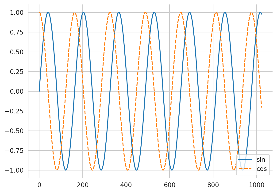
plotly: a graphing library for Python
Source: https://plotly.com/python/.
The force of plotly is that it is interactive and can handle R software or julia on top of Python (it relies on Java Script under the hood).
Usual loading command:
import plotlyAlternatively, you can also use plotly.express to use predefined figures:
import plotly.express as pximport plotly.express as px
fig = px.line(df)
fig.show()
Note
In plotly the figure is interactive. If you click on the legend on the right, you can select a curve to activate/deactivate.
But now you can also create a slider to change a parameter, for instance showing the functions
\begin{align*} f_w: t \to \sin(2 \cdot \pi \cdot w \cdot t)\\ g_w: t \to \sin(2 \cdot \pi \cdot w \cdot t) \end{align*} for w \in [-5, 5]
# inspiration from:
# https://community.plotly.com/t/multiple-traces-with-a-single-slider-in-plotly/16356
import plotly.graph_objects as go
import numpy as np
from plotly.offline import init_notebook_mode, iplot
init_notebook_mode()
num_steps = 101
slider_range = np.linspace(-5, 5 , num=num_steps)
trace_list1 = []
trace_list2 = []
for i, w in enumerate(slider_range):
trace_list1.append(go.Scatter(y=np.sin(2*np.pi*t*w), visible=False, line={'color': 'red'}, name=f"sin(w * 2 *pi)"))
trace_list2.append(go.Scatter(y=np.cos(2*np.pi*t *w), visible=False, line={'color': 'blue'}, name=f"cos(w * 2 *pi)"))
fig = go.Figure(data=trace_list1+trace_list2)
# Initialize display:
fig.data[51].visible = True
fig.data[51 + num_steps].visible = True
steps = []
for i in range(num_steps):
# Hide all traces
step = dict(
method = 'restyle',
args = ['visible', [False] * len(fig.data)],
label=f"{w:.2f}"
)
# Enable the two traces we want to see
step['args'][1][i] = True
step['args'][1][i+num_steps] = True
# Add step to steps list
steps.append(step)
sliders = [dict(
active = 50,
currentvalue={"prefix": "w = "},
steps = steps,
)]
fig.layout.sliders = sliders
iplot(fig, show_link=False)Interactive tools
Shiny: interactive web applications
Source: https://shiny.posit.co/py/.
Shiny helps you to customize the layout and style of your application and dynamically respond to events, such as a button press, or dropdown selection. It was born and raised in R, but is now adapted to Python. It can also be interfaced easily with Quarto to render the app on your website, using a {shinylive-python} cell; see an example at https://quarto-ext.github.io/shinylive/.
The app created is readable, yet the price to pay is the fluidity of the rendering.
#| '!! shinylive warning !!': |
#| shinylive does not work in self-contained HTML documents.
#| Please set `embed-resources: false` in your metadata.
#| components: [editor, viewer]
#| folded: true
#| layout: vertical
#| standalone: true
#| viewerHeight: 630
import matplotlib.pyplot as plt
import numpy as np
from shiny import ui, render, App
# Create some random data
t = np.linspace(0, 2 * np.pi, 1024)
num_steps = 101
slider_range = np.linspace(-5, 5 , num=num_steps)
app_ui = ui.page_fixed(
ui.h2("Playing with sliders"),
ui.layout_sidebar(
ui.sidebar(
ui.input_slider("w", "Frequency", -5, 5, value=1, step=slider_range[-1]-slider_range[-2]),
),
ui.output_plot("plot")
)
)
def server(input, output, session):
@output
@render.plot
def plot():
fig, ax = plt.subplots()
ax.plot(t, np.sin(2*np.pi *input.w() * t), label='sin')
ax.plot(t, np.cos(2*np.pi *input.w() * t), label='cos')
ax.legend(loc='lower right');
return fig
app = App(app_ui, server)
bokeh: interactive visualizations in the browsers
Source: http://bokeh.org/.
Usual loading command:
import bokehAs of today (Oct. 2023), this is not supported in Quarto, so no example is given here. A server is needed (locally or remotely).
vega-altair: declarative visualization in Python
Source: https://altair-viz.github.io/.
Usual loading command:
import altair as altAs of today (Oct. 2023), this is not supported in Quarto, so no example is given here. A server is needed (locally or remotely).
- An interesting tutorial: Altair introduction
pygal: python charting
Source: https://www.pygal.org/.
We use it mostly for maps, and especially for the map of France with DOMs. For instance, see the course Creating a Python module, such a map is constructed:
import pygalTo access the French map plugin you need the installation step that follows:
pip install pygal_maps_frAnimation display with python
Animation with matplotlib
You can use FuncAnimation to animate a sequence of images:
%%capture
from matplotlib.animation import FuncAnimation
from IPython.display import HTML, display
fig, ax = plt.subplots()
xdata, ydata = [], []
(ln,) = plt.plot([], [], "ro")
def init():
ax.set_xlim(0, 2 * np.pi)
ax.set_ylim(-1, 1)
return (ln,)
def update(frame):
xdata.append(frame)
ydata.append(np.sin(frame))
ln.set_data(xdata, ydata)
return (ln,)
ani = FuncAnimation(
fig,
update,
interval=50,
frames=np.linspace(0, 2 * np.pi, 100),
init_func=init,
blit=True,
)display(HTML(ani.to_jshtml()))Another way of displaying video exists, using html5 video:
display(HTML(ani.to_html5_video()))References:
- Matplotlib Animations / JavaScript Widgets by Louis Tiao
Animation with plotly
matplotlib works fine for advanced tuning, but is harder for simple tasks. So just try plotly for basic animations:
import plotly.express as px
from plotly.offline import plot
df = px.data.gapminder()
fig = px.scatter(
df,
x="gdpPercap",
y="lifeExp",
animation_frame="year",
animation_group="country",
size="pop",
color="continent",
hover_name="country",
log_x=True,
size_max=55,
range_x=[100, 100000],
range_y=[25, 90],
)
fig.show("notebook")Spatial visualization
ipyleaflet
from ipyleaflet import Map, Marker, basemaps, basemap_to_tiles
Montpellier_gps = (43.610769, 3.876716)
m = Map(
basemaps=basemaps.OpenStreetMap.Mapnik,
center=Montpellier_gps,
zoom=6
)
m.add_layer(Marker(location=Montpellier_gps))
mfolium
import folium
m = folium.Map(
location=Montpellier_gps,
control_scale=True,
zoom_start=6
)
folium.Marker(
location=Montpellier_gps,
tooltip="Click me!",
popup="Montpellier",
icon=folium.Icon(icon="certificate", color="orange"),
).add_to(m)
mMake this Notebook Trusted to load map: File -> Trust Notebook
lonboard
This is a fast map visualization with Python for large datasets lonboard
3D visualization
vedo: scientific analysis and visualization of 3D objects
Source: https://vedo.embl.es/
This is a Python module for scientific analysis of 3D objects and point clouds based on VTK (C++) and numpy.
R software
XXX TODO.
Java Script
XXX TODO. Out of the scope of this course, yet more powerful.
D3JS
Observable
This is of interest as Quarto can directly read such kinds of figures.
viewof inputs = Inputs.form([
Inputs.range([-5, 5], {value: 0.5, step: 0.1, label: tex`\text{frequency} ~\omega`}),
])
plt = Plot.plot({
color: {
legend: true
},
x: {
label: "x",
// axis: true
},
y: {
// axis: true,
domain: [-1.2, 1.2]
},
marks: [
Plot.ruleY([0]),
Plot.ruleX([0]),
Plot.axisX({ y: 0 }),
Plot.axisY({ x: 0 }),
Plot.line(data, {x: "x", y: "y", stroke : "type", strokeWidth: 2})
]
})
data = {
const x = d3.range(-10, 10, 0.01);
const sins = x.map(x => ({x: x, y: Math.sin(- x * mu), type: "sin(w .)"}));
const coss = x.map(x => ({x: x, y: Math.cos(- x * mu), type: "cos(w .)"}));
return sins.concat(coss)
}
mu = inputs[0]